View this PageEdit this Page (locked)Attachments to this PageHistory of this PageHomeRecent ChangesSearch the SwikiHelp Guide

RGA Project Part 3

Project Description


Dining away from home is a common experience in this age of convenience and many people make the decision to eat at a restaurant when they are already out in the community. These people are in what we define as a mobile environment, in transit and away from their home, office, and any personally established location. They are in a unique situation in terms of dining in a restaurant because there is currently not a well-designed system available to find a restaurant while in a mobile environment. We seek to support the tasks of finding a restaurant in terms of gaining information based on certain criteria, selecting a restaurant based on this information, identifying additional information about the restaurant (for example menu items), establishing the directions to this restaurant from the present mobile location, and actually physically finding the restaurant. This system will be aimed at a user population which is of a variety of ages, but which is familiar with the concept of finding a restaurant in both novel and familiar environments. More specifically, it will focus on a population with vision and mobile capabilities, who are experienced with the use of a PDA, and who are most likely college students or business professionals.

Design Summary


The design space for our potential interfaces is all somewhat similar in that they are all mobile. The nature of our problem demands the solutions be mobile ones. Our problem is to find an effective manner for users to search for restaurants in a familiar and possible unfamiliar mobile environment. The design space of our interfaces could be a user walking down the street, a user driving in an unfamiliar or familiar area, or in any number of situations where the user finds himself away from conventional computer-based or paper-based methods of finding a restaurant.

Based on a number of observations we arrived at a final design that centered around a mobile platform, specifically utilizing a PDA. In the previous part of this project, we proposed three separate prototypes. One was a voice-activated system that allowed the user hands-free access to a limited amount of information. This small amount of information was needed to keep the mental demands on the user to a minimum. We also proposed a system that would work solely with groups. This system would attempt to find a agreement point for a disagreeing group in a restaurant finding situation. The problems with these systems are listed in detail in section two of this project.

Thus, we decided to use most of our third proposed prototype, which was a restaurant finder interface on a PDA. In the end, we chose to use a large majority of the pieces of the PDA prototype because of its ease of use, ease of production, and most importantly its vast mobility. Additionally, upon examination, this prototype best adhered to the usability principles that we considered to be of import- familiarity, recoverability, and customizability. The PDA prototype was the one that allowed us the greatest ease in accomplishing these goals. It is clearly mobile, it draws from experience using PDA interfaces and Internet restaurant search pages, and thus, is familiar to users, based on the design allows for ease of recovery with back buttons, and is customizable as well.


Representation A - Physical Model


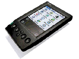
The physical model for this project is a handheld device. For practical purposes it makes sense to use a device that the user would already have instead of making a dedicated device. Our user group was decided to be that of college students and business people, these two groups are already users of PDA's and so the learning curve will not be too great. The basic device will consist of a PalmOS based handheld:
Uploaded Image: part3_phys001.gif
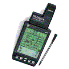
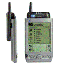
This device may be expanded for additional functionality to be provided. The two options for expansion are GPS locator and/or a wireless internet connection. Examples of these two are below:
Uploaded Image: part3_phys002.gifUploaded Image: part3_phys003.gif
These examples show what the system will look like and it is most practical on a general purpose device. For this reason, the choices are limited to Palm or WinCE devices and we choose the Palm for ease of use and compact form factor.

Representation B - Storyboard of Overall Functionality


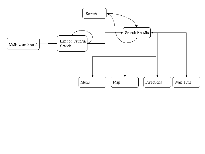
Explanation of State Diagram:
Uploaded Image: part3_diagram.gif
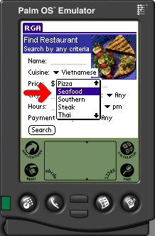
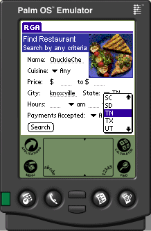
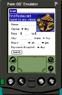
The basic flow of control for the Restaurant Finder is described in the state diagram displayed above. It has two main start states, one for the single user (or at least the mode where the system assumes a single user) and the multiuser mode. The single user mode goes to a search screen that allows the user to specify search criteria for a restaurant. These criteria are cuisine type, name, price, location, hours, and payments accepted. The location field allows two options for specifying the location, one which is based upon your current location and is determined via GPS or wireless internet connection. The other option is to specify a destination location if where the user wishes to eat is not the same as where they currently are.
Uploaded Image: part3_proto001.gif
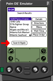
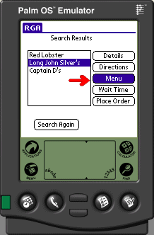
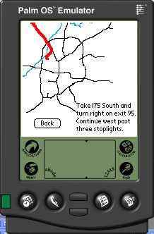
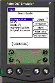
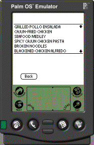
Once a user makes the appropriate selections the system consults its database of restaurants and presents a list of the top choices that meet the selection criteria. This list has a group of buttons to its right, these buttons present the following options that the user can perform on any restaurant. These include getting menu options, directions to the restaurant, a map to the restaurant, and wait times for the restaurant. To view these details the user selects the appropriate restaurant and the selects the option which they wish to see. In each of these submenus there will be appropriate options for both going to the next restaurant detail screen and to also go to the next restaurant. This will allow the user to go the menu choices and quickly scan through a group of restaurant choices. This functionality for ease of switching between restaurants is not shown in the screenshots below from our limited functionality prototype.
Uploaded Image: part3_proto002.gifUploaded Image: part3_proto003.gif
The multi user search function starts by asking the user how many users wish to give recommendations for the restaurant and what the location to search is. The location field can be filled out as above, either by the current location or by the destination. The multi user screen then goes to the search criteria screen for the first user. This search screen is much simpler than that of the single user search, which is to make the possible choices a bit more limited to assist in making an accurate choice. All the user is allowed to select are first and second choices for cuisines. The user then presses next and hands it to the next user. Once all the users have entered their options the system goes to the same search results screen as the single user mode.

At every point in this system the user can go to the state directly previous to the one it is at to allow it to recover from mistakes.

Customizability Example:
The user is allowed to customize the application to suite their personal needs. This is accomplished in several ways. First of all the application can remember the most recent searches assuming that the user may wish to search again for the same thing. The other way in which the user can customize the interface is through the list of favorite restaurants. There are two ways to populate this list, one is by selecting restaurants that you wish to have in the list. The other is to have the system to make some guesses by the types of searches you perform and to have it suggest those that it believes the user will like the most.

Recoverability Example:
The recoverability of the system is very important since in a mobile environment the user is forced to use more awkward methods of input and so getting the input right and not having to reenter information is very important. This application provides for recoverability through the use of back buttons throughout the interface. This allows the user to easily move around the menu system and not to have to start from scratch each and every time. This is particularly useful in the search results screen, where if you press back it will return you to the search screen with your current criteria filled in so that you can refine it without reentering it all.

Familiarity Example:
The main search interface is modeled after the web based form structure that is the basis for most of the web based restaurant guides. It provides a group of fields that you can enter any combination of inputs to produce a search.

Representation C - Limited Scope Functional Prototype


Prototype
ZIP file containing complete source and object code of the restaurant finder application: RGA_dev.zip

Scenarios

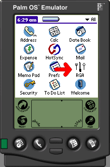
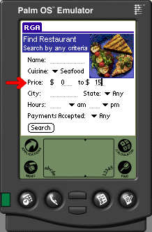
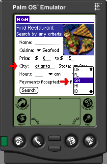
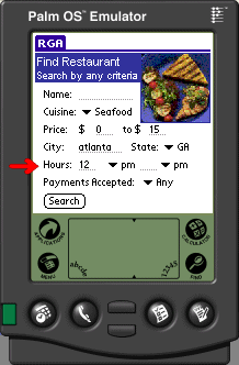
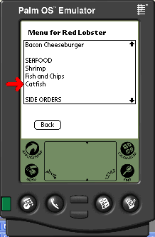
Mr. Smith decides that he wants seafood for lunch, but does not want to spend too much money, since he is saving his money to buy his family very nice Christmas presents. Therefore, Mr. Smith selects “Seafood” from the drop-down list of cuisines. Then he clicks on the first field in Price and enters “0” and clicks on the second field and enters “15.” Mr. Smith clicks on the “Search” button, and the restaurant finder application brings back a list of 100 results. Having no time to scroll through all these results, Mr. Smith presses “Search Again,” which takes him back to the search screen. Mr. Smith’s original search criteria are preserved, so he clicks on the city text field and enters “Atlanta” and selects “GA” from the state drop-down list. Mr. Smith also realizes that it is only noon, and many of the seafood restaurants in the area do not open until 5pm. After realizing this fact, Mr. Smith clicks on the first text field of hours and enters “12” and selects “pm” from the pop-up box adjacent to it. Mr. Smith clicks “Search”, and the application brings back three results: Long John Silver’s, Captain D’s, and Red Lobster. Mr. Smith feels like he is really in the mood for catfish, so he wants to make sure that it is available at the restaurant that he selects. He selects Long John Silver’s from the list, and clicks the “Menu” button the right. Mr. Smith browses through the menu, but catfish is not listed. He clicks “Back”, selects Red Lobster, and clicks “Menu”. This time Mr. Smith finds catfish on the menu. He clicks “Wait Time” to view the current waiting time, which is 30 minutes. Mr. Smith knows that he will never be able to make it back to work in time if he has to wait that long, so he clicks “Back”, selects Captain D’s, and finds catfish on the menu. He proceeds to click the “Directions” button to get driving directions to the restaurant. The application displays the map, and Mr. Smith jots down the textual driving directions. Mr. Smith then closes the application and his Palm device, and drives to Captain D’s.
Uploaded Image: part3_scnro001.gifUploaded Image: part3_scnro002.gifUploaded Image: part3_scnro003.gif
Uploaded Image: part3_scnro004.gifUploaded Image: part3_scnro005.gifUploaded Image: part3_scnro006.gif
Uploaded Image: part3_scnro007.gifUploaded Image: part3_scnro008.gifUploaded Image: part3_scnro009.gif
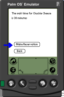
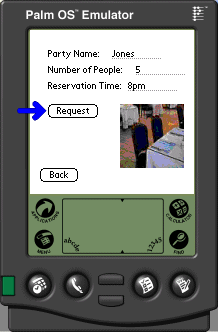
Mr. Jones and his wife has decided to throw a birthday party at Chuckie Cheese for their son’s tenth birthday one night. The parents know that the restaurant is usually busy on Saturday night, so Mrs. Jones starts the restaurant finder application on her Palm device. On the search screen, she enters “Chuckie Cheese” in the name field and enters “Knoxville” as the city and selects “TN” from the state drop-down list. She then clicks “Search” and the application returns the expected restaurant for the birthday party. She clicks on “Wait Time” and sees that there is a one hour wait. They want to have the party at 8pm, so Mrs. Jones clicks “Make Reservations.” Mrs. Jones enters 8pm as the reservation time, and enters 5 for the number of people, since she knows that her sons wants to invite two of his friends to his party. Mrs. Jones then exits the restaurant finder application, and the parents are assured that their child’s birthday will not be ruined due to long wait times.
Uploaded Image: part3_scnro010.gifUploaded Image: part3_scnro011.gifUploaded Image: part3_scnro012.gif


Detailed evaluation plan


Evaluation A - Cooperative Evaluation


Usability Criteria Addressed
Performing a cooperative evaluation on the Limited Scope Functional Prototype will address the usability criteria of familiarity, recoverability, and potentially customizability. Since it is an observational technique, in which an end-user performs a task typical for the system, it will be possible for them to comment on how easy it is to learn the system based on similarities to existing systems (familiarity), to observe unintended actions and the ease with which they can be corrected (recoverability), and it will be possible to question the user about potential shortcuts that could be developed for experienced users (customizability). However, to perform this technique several inputs are necessary.

Inputs Required
To perform a cooperative evaluation it is necessary to identify the task that is to be performed by end-users. In this case, the task will be to search for a restaurant using the criteria of cuisine, price, and city, and to locate directions and make a reservation for the restaurant that they choose. We will indicate that since the prototype is limited in functionality, it does not contain a large number of restaurants and they must choose a restaurant from the list provided. We will instruct them to perform the task and voice what and why they are performing certain actions and we will indicate that they should ask any questions or voice any concerns that they develop.

Resources Required
The cooperative evaluation will be performed using the limited scope functional prototype. Thus, it will involve the use of a PDA. The individuals using the PDA and performing the assigned task will be a sample of the user population, which is outlined in part one of this project, but in brief, they should be experienced with a PDA, have vision and motor capabilities, and be either a college student or business professional. We would like to target at least five of these individuals to participate in the cooperative evaluation.

Two members of the design team will observe this task. They will both record what the user says on a form indicating the user's demographic information such as name, age, and amount of experience with a PDA. This form will have areas to record each action and then comments that the user makes about each action. It will have a separate section for questions and comments that the user makes. One member of the design team will also ask the user questions when he or she is not clearly indicating why a particular action is being performed. The other member of the design team will assist in the recording to ensure that all comments are recorded. He will not ask questions, since two members questioning the user could be intimidating to them. The two members of the design team will switch roles for each different user, to eliminate evaluator bias.

Evaluation B - Heuristic Evaluation


Usability Criteria Addressed
We will be able to evaluate all three of our usability criteria with this evaluation. The three that will be addressed will be Familiarity, Recoverability and Customizability.

Inputs Required
A Heuristic Evaluation will be performed on the storyboard representation of our design. We will have a number of different evaluators run through the storyboard as if they were using the system itself and address a number of heuristics that will be laid out. The following ten heuristics, which will be used as guidelines for the evaluation, are drawn from Dix, Finlay, Abowd, & Beale (1998). These guidelines will allow the evaluators to focus their attention on certain aspects of the design. Following these guidelines also allows for coverage of all of the above mention usability criteria. The heuristics to be used for the evaluation are as follows:

1. Visibility of the system: It is important for the user to be able to see what is happening within the system and to receive the appropriate information and the appropriate times from the system.

2. Match between system in the real world: Especially in our design, it is important for the user to be able to leverage off of some experience they have had in the past. This will allow for faster learnability of the system

3. User control and freedom: To have an effective system, the user must be able to move freely within the system without running into any unexpected roadblocks. Also, the user should be able to easily reverse course if they find themselves somewhere they do not wish to be within the system.

4. Consistency and standards: Throughout the system it is very important that the system remain consistent in how it acts and how it feels to the user.

5. Error Prevention: To reduce confusion and other problems with the system, the design must take into account actions that would cause errors.

6. Recognition rather than recall: The system should place as little mental load on the user as feasibly possible. Therefore, presenting information to be recognized would be preferable to relying on information the user has to recall from memory himself.

7. Flexibility and efficiency of use: There should be present in the system that would allow an expert user to speed up the interaction but are not noticeable to the novice user

8. Aesthetic and minimalist design: The system need only present information that is relevant to the completion of the task. All other information has the possibility of hindering the completion of the task

9. Help users recognize, diagnose and recover from errors: Make errors messages in language the user can understand and have easy and recognizable methods available to correct these problems

10. Help and documentation: Any necessary documentation the user needs to operate the system for effectively should be easy to access and easy to search and browse through.

Resources Required
This evaluation will require several evaluators to go over the system and address the heuristics mentioned above. Four to five evaluators will be needed to capture the most usability problems while saving on resources. These evaluators will be students in the HCI class. They will be walked through the storyboard representation by a member of our team and then each student will independently evaluate the system based on the above heuristics. Each student will be provided with a form listing the heuristics, and with appropriate space to make comments about each heuristic. After each evaluator has performed their evaluation, our design team will meet with them to discuss problems with the system and violations of usability principles and heuristics. We will assign a severity rating to each of these problems based on frequency, impact, and persistence.

Evaluation C - Cognitive Walkthrough


Usability Criteria Addressed
The cognitive walkthrough will centrally address the criteria of familiarity, since it is designed to explore learnability though exploration. Peripherally, however, it may also address recoverability, since the user will be performing a task sequence and could potentially make errors.

Inputs required
Prototype Description: This input is supplied in the previous section, in which the prototype is clearly described. However, this evaluation will be performed on the limited function representation, and since it actually has functionality, it will be more than adequate for a description.

Task description: The task being examined is to search for a restaurant using the criteria of cuisine and price and then to find the restaurant's menu options and directions to the restaurant. This task is representative of one that most users would perform on this system, and in addition it utilizes two forms of input method, selecting a choice from a pull-down menu and entering information using pen-recognition such as Graffiti.

Action Sequence:

A1. Fill in criteria of price using pen to write price.
R1. Screen displays acceptable price range.

A2. Select a cuisine type from a pull-down menu.
R2. Screen displays selected cuisine type.

A3. Use pen to select search icon.
R3. Search results are listed, along with several options on the right portion of the screen, including details, menu, directions, wait time, and order.

A4. Select restaurant of choice.
R4. Restaurant of choice is highlighted.

A5. Select menu.
R5. The restaurant's menu is displayed.

A6. Select "back."
R6. The restaurant list is again displayed, along with the above mentioned options.

A7. Select "directions."
R7. The screen shows a map, along with text directions to the restaurant.


Resources required
The cognitive walkthrough will be performed on the limited scope functional prototype. It will not require end-users to perform this technique, but instead it should be performed using "HCI experts." These experts will be five of our CS4750 classmates. These classmates are required to have experience with a PDA and searching for a restaurant. In addition, they will have knowledge of evaluation techniques and usability principles. They will be provided with a set of standard forms to use for the completion of this evaluation technique. Specifically, they will be given a form that asks their name, the date, and the time of the evaluation. This form will then provide them with the four questions that must be answered in a cognitive walkthrough, along with sufficient space to answer these questions. The questions are as follows:

1) Will the users be trying to produce whatever effect the action has?
2) Will users be able to notice that the correct action is available?
3) Once users find the correct action at the interface, will they know that it is the right one for the effect they are trying to produce?
4) After the action is taken, will users understand the feedback they get?

In addition to the form providing space for the answers to these questions, an additional form will be provided for each question, so that the evaluators can address any negative answers that they make on the original form, in answering the four questions. The form for comments on negative answers will prompt the evaluators for a detailed description of the usability problem, an estimation of how frequently the evaluators think the problem will occur, and how serious the problem will be for the end-users.

Link to this Page