
There’s only a little more than two weeks left in the Dream Build Play 2017 competition. I’ve been really busy between work, the Ludum Dare 40 competition, hosting and editing the Knoxville Game Design podcast, and visiting fellow game developers in Lexington, Kentucky. However, I did manage to find some time tonight to spend working on my Dream Build Play entry called Turn Back the Clocks 4.
I really didn’t update any of the gameplay tonight, and I solely focused on making the graphical user interface stand out. The first thing on the laundry list in my head was to display the individual points scored for each clock hit. This is the ball score (5 points for blue, 10 points for red, and 25 points for yellow) multiplied by the current combo. I really need to add a screen which explains the points system. Now whenever a clock is hit, the associated score is displayed below the total score and scrolls downward and fades out. The score text is also the same color as the ball which hit it, so the player can see the score made from one of the bonus (red or yellow) balls.
One problem that I noticed was that the blue text was too difficult to read. I ended up picking a lighter shade of blue on the Shades of Blue Wikipedia page called Crayon blue, which is #1F75FE in hex or (31, 117, 254) in RGB. The Unity color selector for the Text component accepted the hex value, but I had to remember to divide those three values by 255 to set the light color in code in Unity, because the Color object expects the RGB values to be floats in the range of 0f to 1f. I also updated the blue in the clock texture to match accordingly. I made constant Color variables in my Ball class to hold the red, blue, and yellow ball colors. This way if I ever need to change the color again, I’m only need to update the color in the Ball constant.
Another change was making the board color lighter. This made the balls and activated clocks stand out better, but I also had to darken the color of the inactive clocks which were already light gray. Since the board used the same material as the title text, I duplicated that material. I haven’t found a way to duplicate materials in the Unity editor, so I just have to select the material and display in explorer, and then copy and paste the material. Now the title screen has a copy of the material, which I made a golden color. I disabled the material normal map for the title text, because it looked too gritty. I also updated the title mesh in Blender, and lined up the Y coordinates of the front vertices of the mesh. I could see artifacts of the triangles in the light which looked bad. Lining up the vertices can be done in Blender by scaling by zero on the Y axis. It still really didn’t look the way I wanted, so I selected the front faces and turned off smooth shading, which fixed the problem.
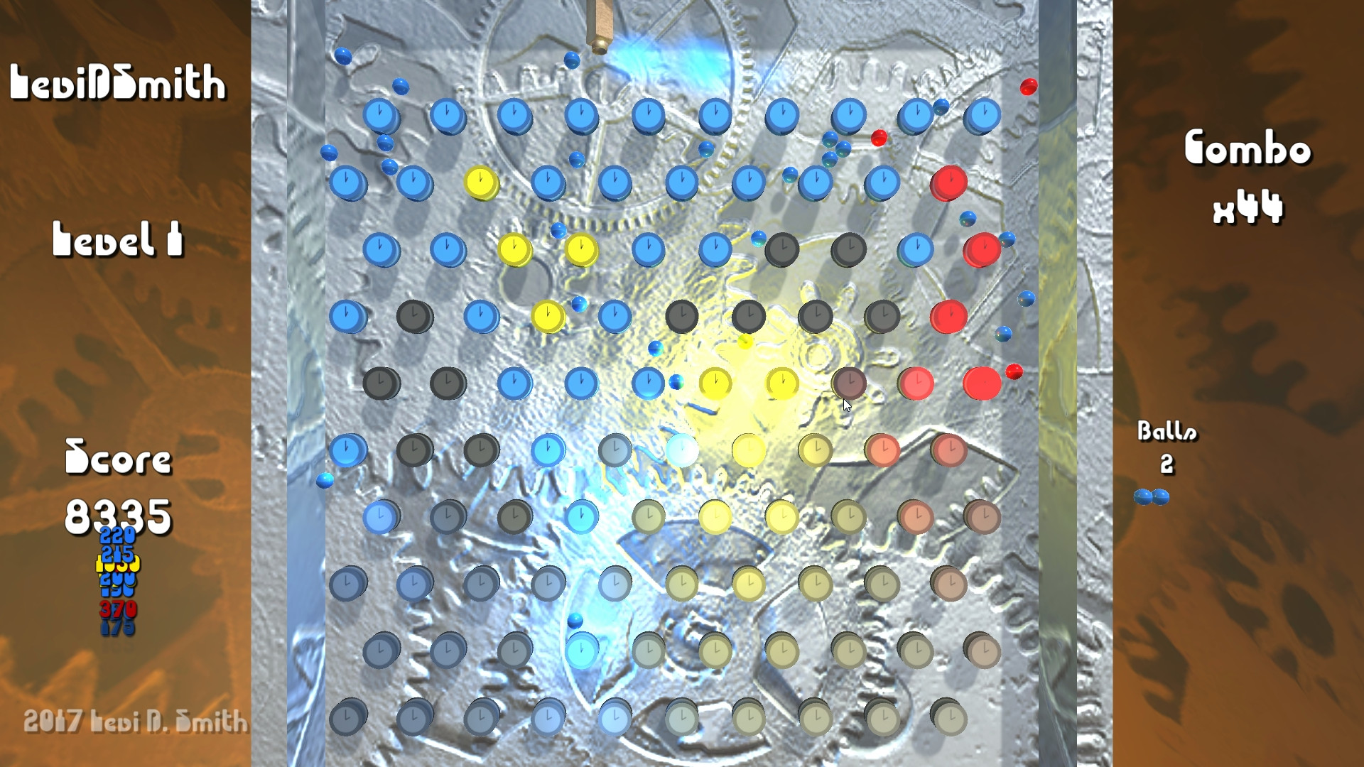
Going back to the graphical user interface, I thought that the “PERFECT” display looked really plain. I ended up writing a simple script which scaled the text in and out on the X axis. I set variables to track if the scale is expanding or contracting along with the rate, minimum, and maximum scale values. Once the scale value hits one of those boundaries, I flip the sign of the rate value which is multiplied by Time.deltaTime. I also made the perfect text green, so it stands out from everything else on the screen. When all of the clocks are enabled, I also added a 20000 score display in green to the the scrolling score values. There is a slight problem in that the 20000 score displays at the same time as the score of the last clock hit, so it overlaps it. However, I think that is fine as long as the 20000 score is on top, which is more significant.
The last interface change I made was to the combo display. I broke the word “Combo” and the multiplier display into two separate text objects. That way I could keep the size of the “Combo” text the same and scale the size of the multiplier text. Using some math, I made it so that when the combo value is displayed or incremented, it is twice the regular size, and scales down to normal size during the combo period. I thought that this emphasized the point that the combo expired over time.
There are a few more changes that I want to make before the competition is over. I want to add different configurations of the clocks. I’m not sure if I’m going to do that programmatically or define the layouts in a data file. I may just have the player play through each of the levels sequentially, but it would be nice if I had a level select screen, with target scores for each of the levels. If I did that, then I would need to update my leaderboard PHP code and MySQL database to accept scores for different levels on a game. It wouldn’t be that difficult of a change to make, and it would definitely be useful for leaderboards in my other games. Games with just one leaderboard could just set the level number to a default value like 0 and just ignore it.
I would also like to include a few more mini-game bonuses like a slots that are enabled if you meet certain conditions. I’m not sure if that would be when a ball falls in a certain area (like in pachinko) or if it’s enabled when all of the clocks are activated. I think the extras would all be based on luck, such as spinning a wheel for a bonus. It would just be something a little different to break up shooting and watching the bouncing balls.